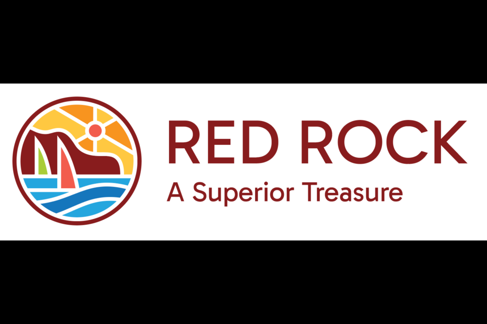
RED ROCK — The people of Red Rock have spoken.
Following a series of surveys that were made open to residents of the township, Red Rock’s council and administration have settled on a new logo.
Based on the results of the final survey, residents have chosen “Option #2” which features a distinctly red mountain in the background as opposed to the green version featured in “Option #1”.
The final survey received 125 responses with 90 (or 72 per cent) of those being in favour of option two.
Mark Figliomeni, Red Rock’s chief executive officer, delivered the results in his report to town council at their regular meeting recently held on April 2.
He then handed the floor to Community Development Officer, Ashley Davis, to field questions and update council in regards to what the next steps of their community interpretation plan are.
Davis said the township’s administration will take council’s decision – in this case, to go with the option that most respondents were in favour of – and develop a full set of image guidelines along with an implementation plan to phase in the new logo.
“They will essentially say here are all of your colour codes, your fonts… and how they will be used in all of the various ways that our logo is used,” she said.
Some examples of changes that will need to be made, Davis said, go beyond signage around the community to include email signature lines and switching letterheads.
Davis said that drafting an implementation plan “all leads up to larger sign replacement,” which she noted Destination Northern Ontario, Parks Canada - Lake Superior National Marine Conservation Area, and other tourism-oriented funding streams could support to lessen any financial impacts on the township’s budget.
She also observed that some signage likely won’t need to be replaced – such as existing signage along the highway 17 – because it already closely resembles the newly chosen logo.
Davis noted, however, that smaller materials such as brochures would be on the township’s dollar – but, as Councillor Mickel Smith pointed out, the township already budgets for that.
Regardless, with approval from town council, Davis and Red Rock’s administrative staff can now begin drafting guidelines and an implementation plan to achieve their vision of a unified image for the township.
